Designing the Visual Identity for Blake Griffin's Prank Series
Role: Creative Director & Motion Designer
Client: TruTV
Host: Blake Griffin
Scope: Show Identity System, Title Sequence, Lower Thirds, Graphics Toolkit
The Brief
The show needed a visual language that could frame pranks as precision operations rather than cheap gags. Blake's involvement signaled a more elevated take on the genre, and the graphics had to match. Something that felt designed, not default.
The deliverables included a logo system, title sequence, lower thirds, transitions, and a flexible format for introducing each prank's setup.
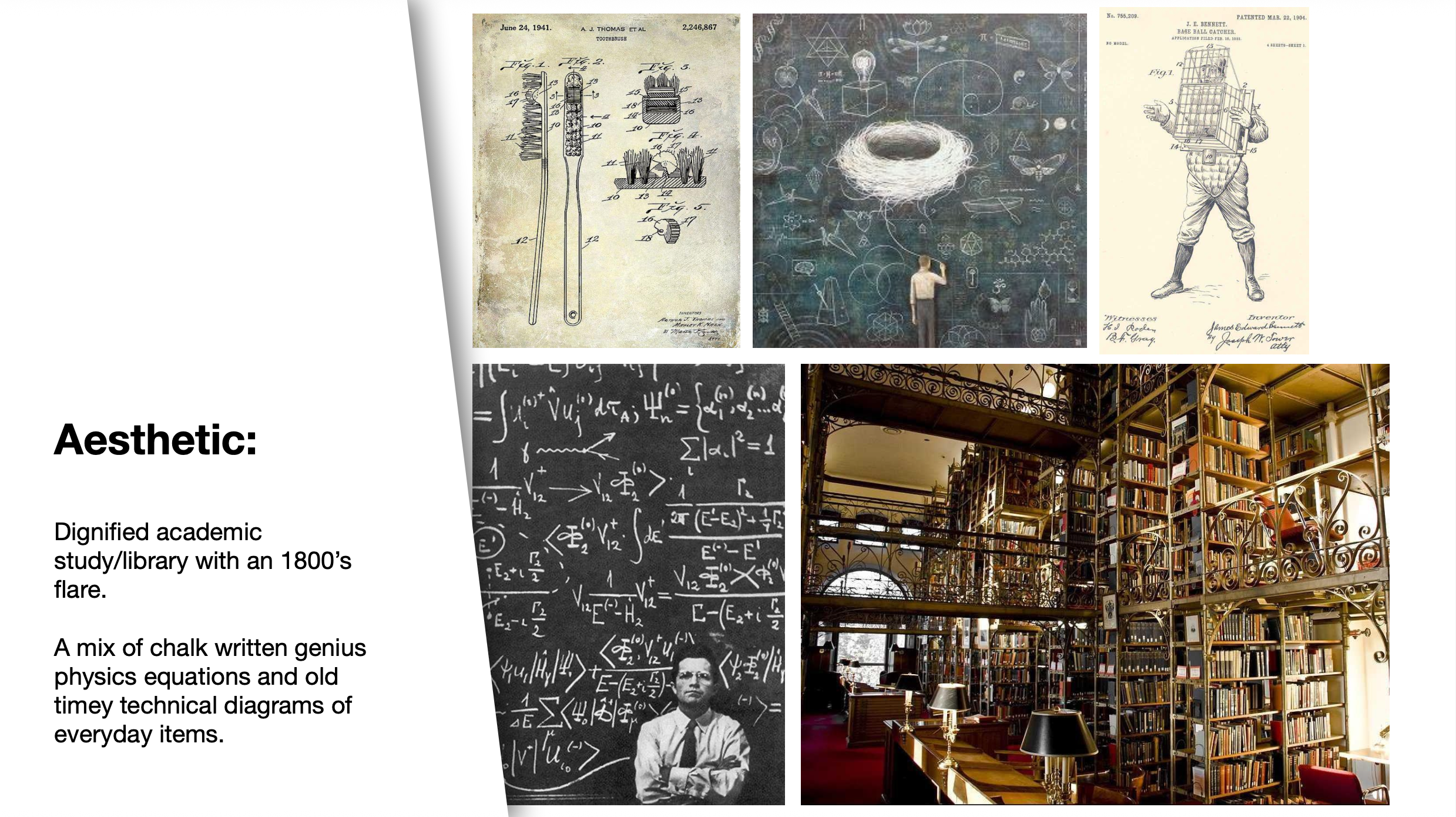
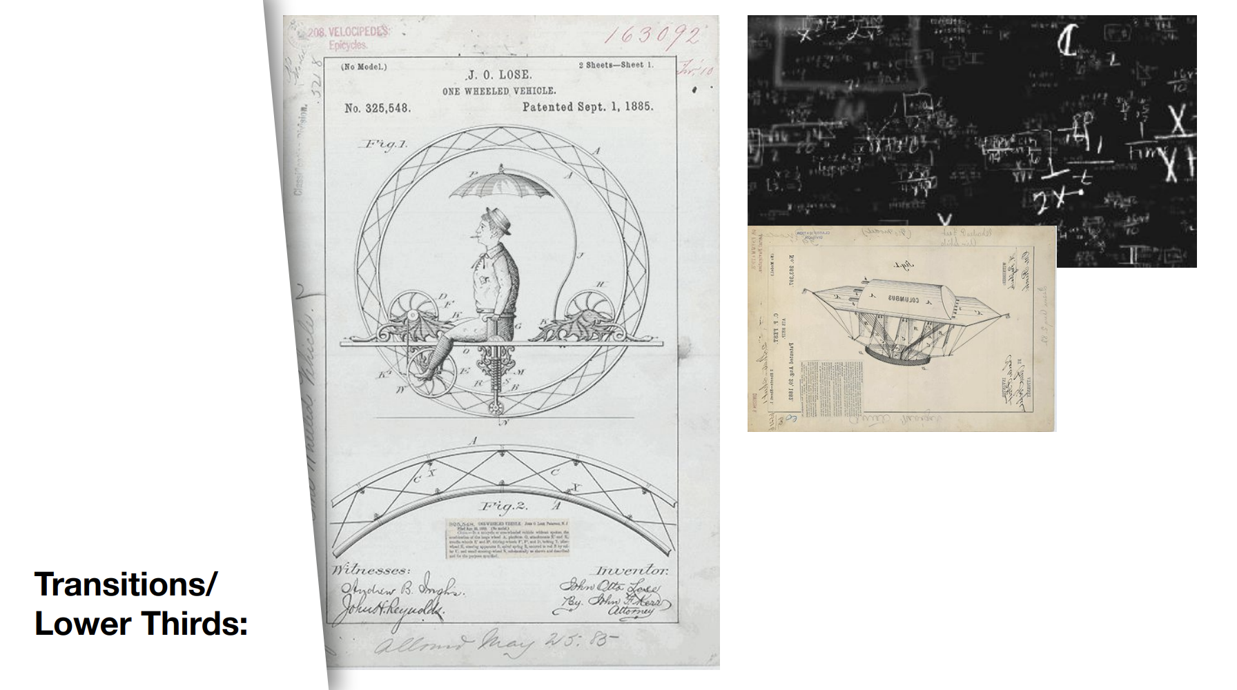
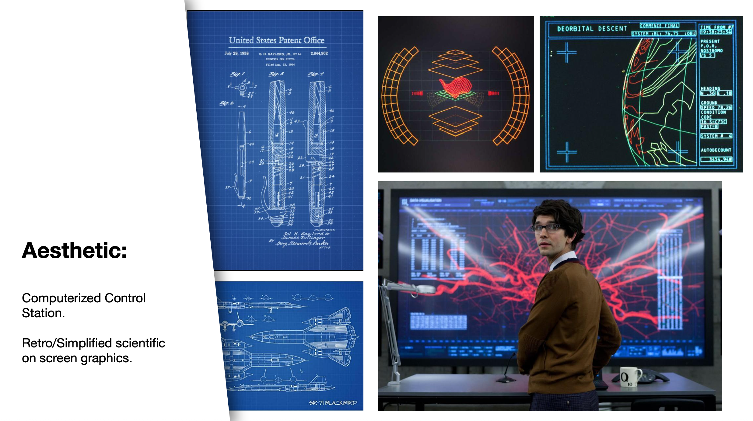
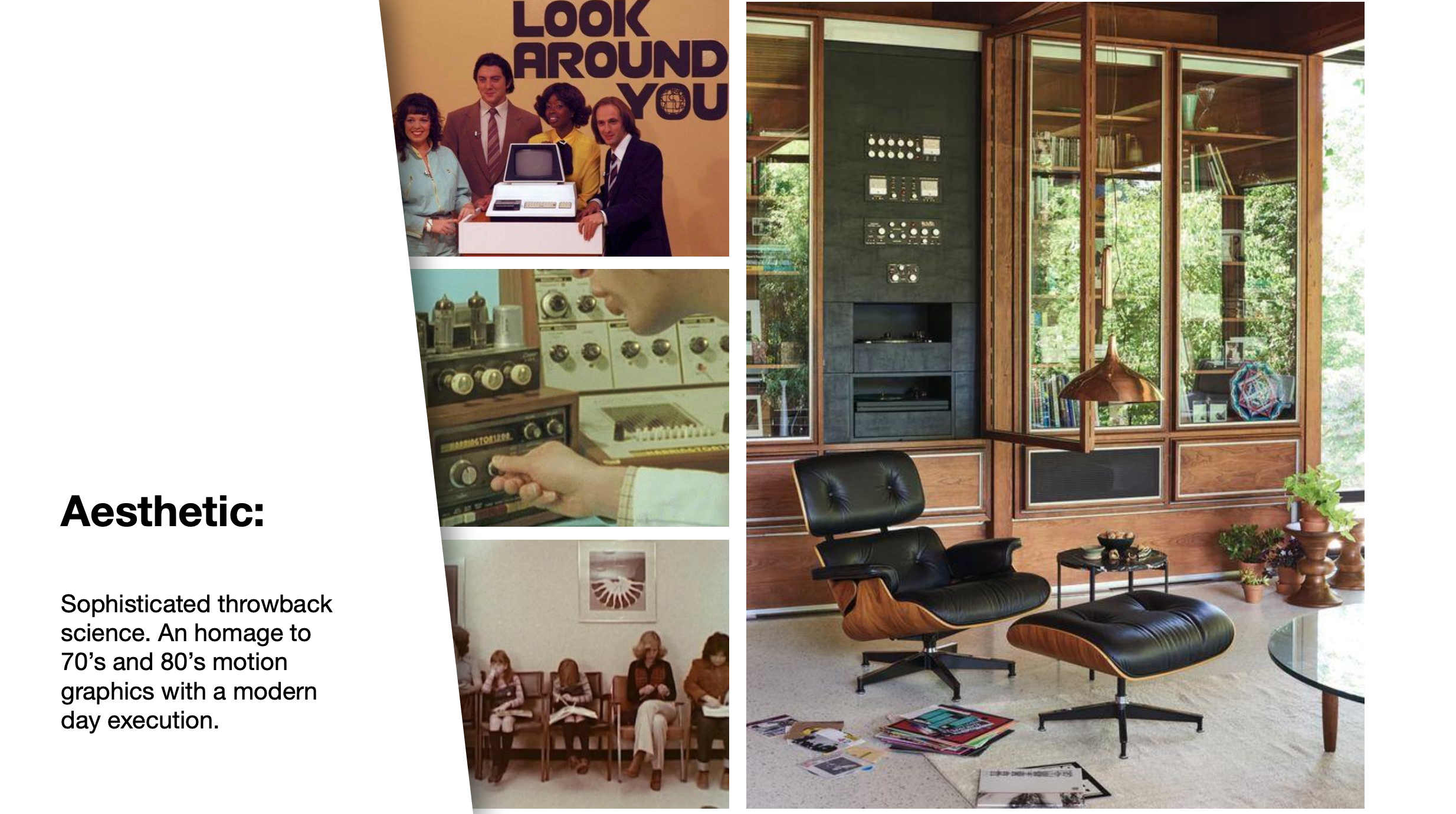
The Aesthetic Direction
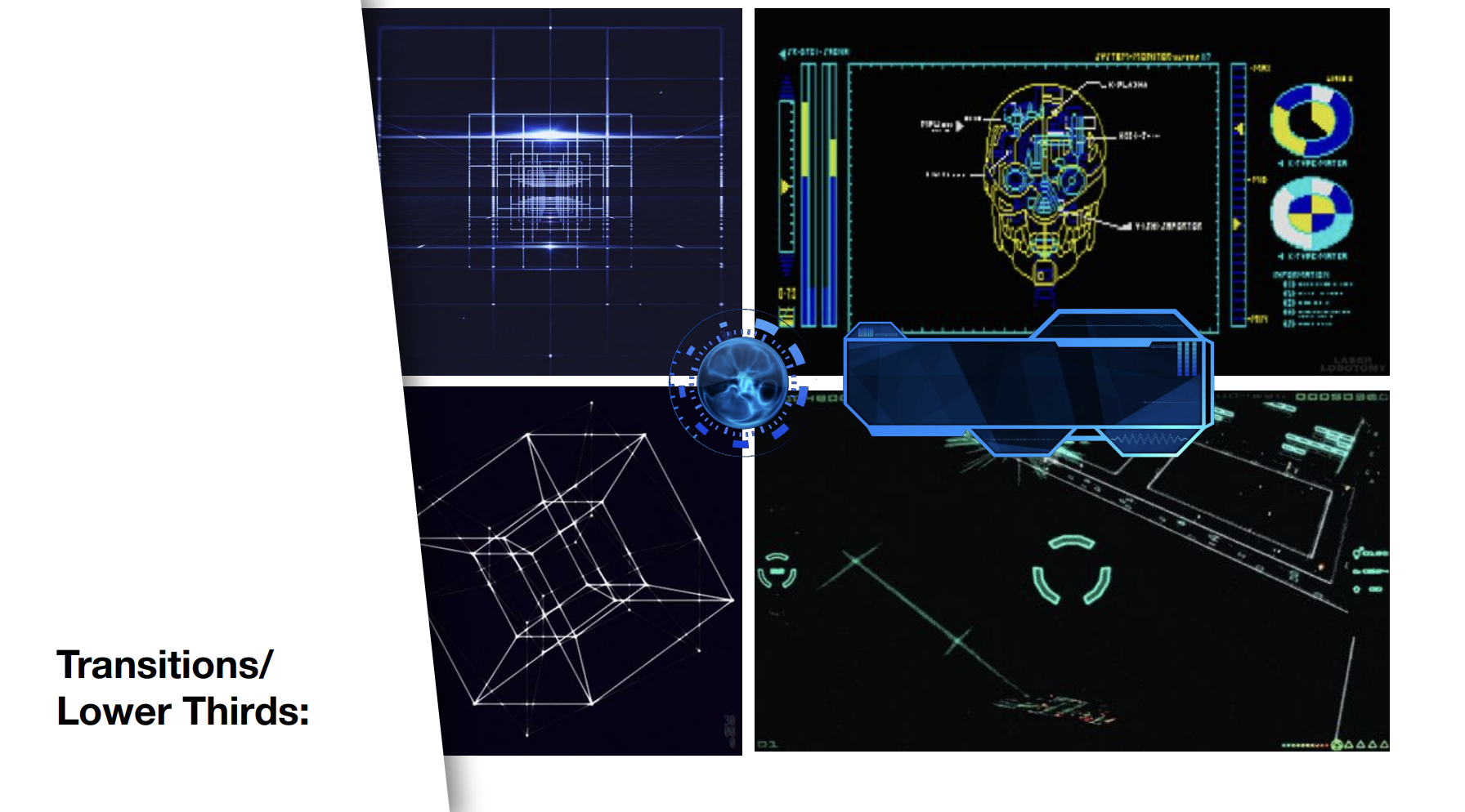
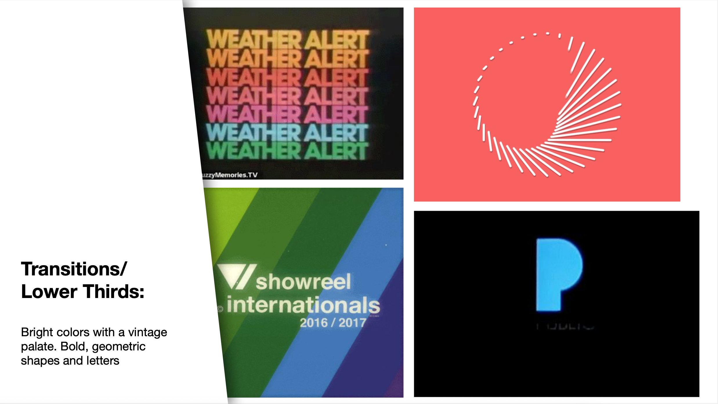
I pitched three distinct visual approaches: a dignified academic study with 1800s-era patent drawings and chalkboard equations; a computerized control station with retro scientific UI; and a sophisticated 70s/80s throwback with bold geometric shapes and vintage palettes.
Overview
Double Cross with Blake Griffin is TruTV's hidden-camera prank series in which the NBA star orchestrates elaborate setups where the prankster becomes the pranked. The show's premise hinges on deception and reversal, and the visual identity needed to serve that narrative mechanic while establishing a tone that felt smart rather than slapstick.
I was brought on to develop the complete graphics package, from logo system through broadcast-ready toolkit.
Comps For Director Review
The selected direction merged the first two.
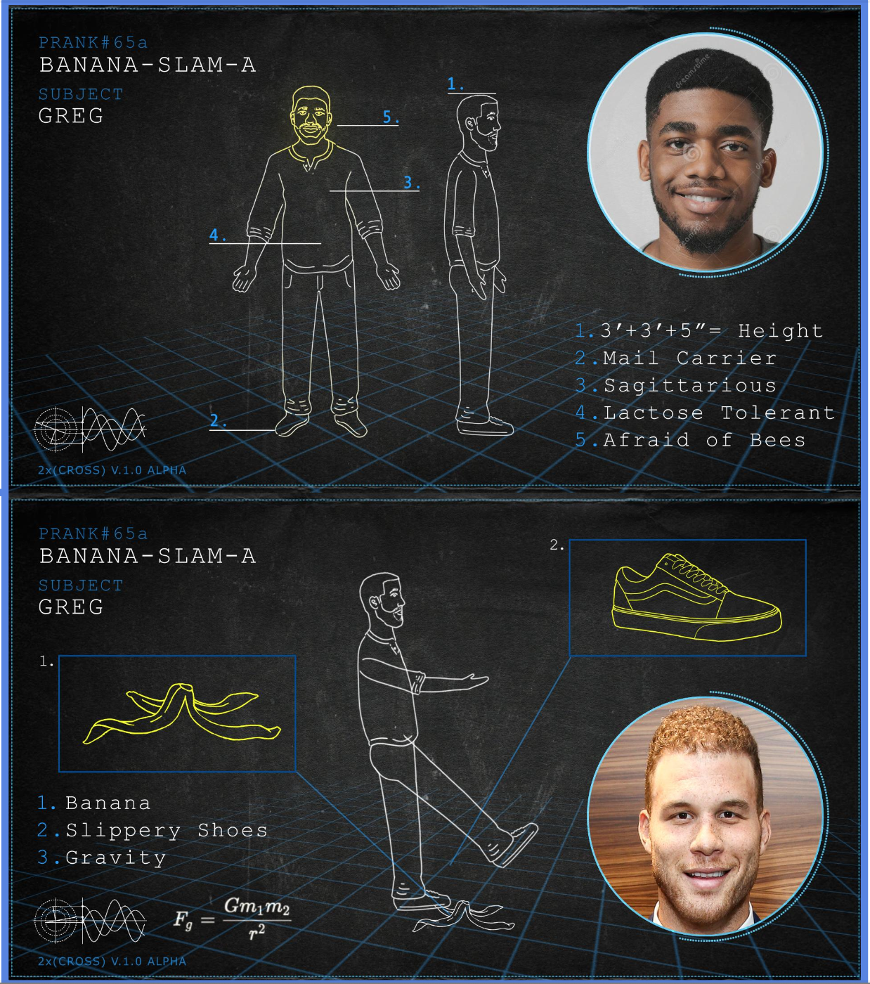
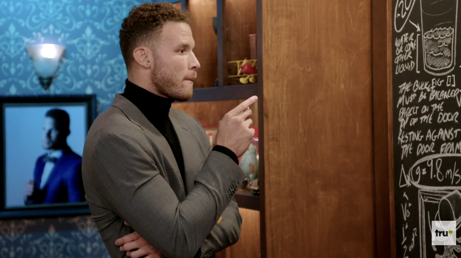
A digital blackboard environment that treated each prank like a schematic diagram, complete with floating equations and technical annotations. The tone landed somewhere between mission briefing and absurdist lecture.
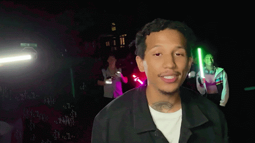
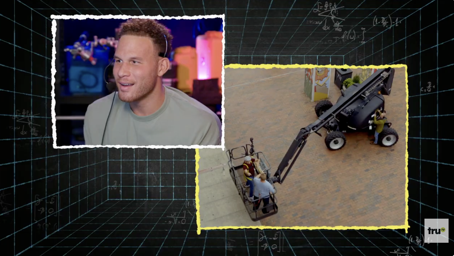
The blackboard became the show's signature format: a multi-use asset introducing each prank's subject, props, and variables. Technical diagrams, floating equations, and schematic illustrations animate in as Blake narrates the setup. A mortice window allows for picture-in-picture commentary.
This format solved a structural problem. How do you convey prank logistics without killing momentum? The answer reinforced the show's pseudo-scientific tone while keeping the pace tight.
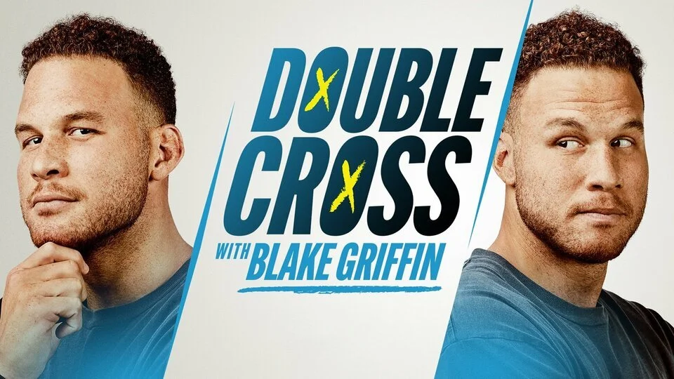
The Logo System
The Double Cross wordmark integrates hand-drawn X marks into the letterforms, reinforcing the show's core conceit. I developed multiple variations with differing levels of roughness, plus a version with X cutouts in the Os for flexibility across applications. The hand-drawn elements were deliberately inconsistent. Each X feels scratched rather than rendered, giving the identity a conspiratorial energy.
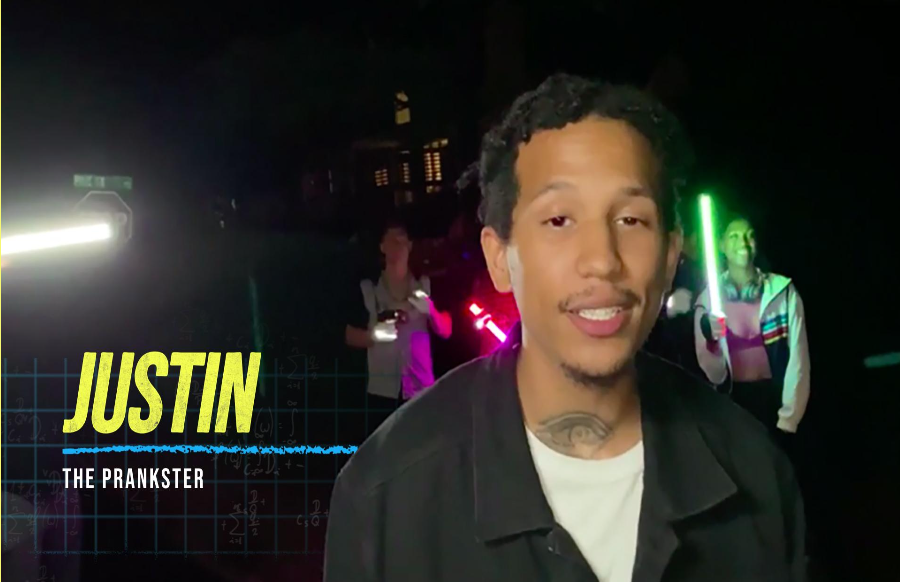
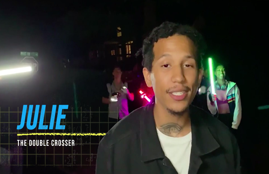
Lower Thirds & Color System
I developed a lower third system with narrative color coding: white for the host and actors, yellow and blue inversions for the prankster and double crosser. The color shift signals the audience when roles reverse mid-prank, embedding the show's twist mechanic into the typography itself.