
Designing the Visual Identity for Kevin Hart's Action-Comedy Franchise
Role: Graphics Supervisor & Title Designer
Client: Hartbeat / Roku
Director: Josh Ruben
Scope: Title Sequence, Main Titles, Custom Typeface
Overview
Die Hart is Kevin Hart's Emmy-nominated action-comedy franchise for Roku, in which he plays a fictionalized version of himself desperately trying to be taken seriously as an action star. By Season 3, the show had become Roku's most successful original series, with Season 2 setting records as the #1 premiere weekend in the platform's history.
I returned as Graphics Supervisor & Title Designer for Season 3 after establishing the visual language for Season 2 under director Eric Appel. With new director Josh Ruben at the helm and a shifted premise—Kevin now chasing critical prestige alongside J.K. Simmons as a legendary auteur—the visual identity needed to evolve.
The Brief
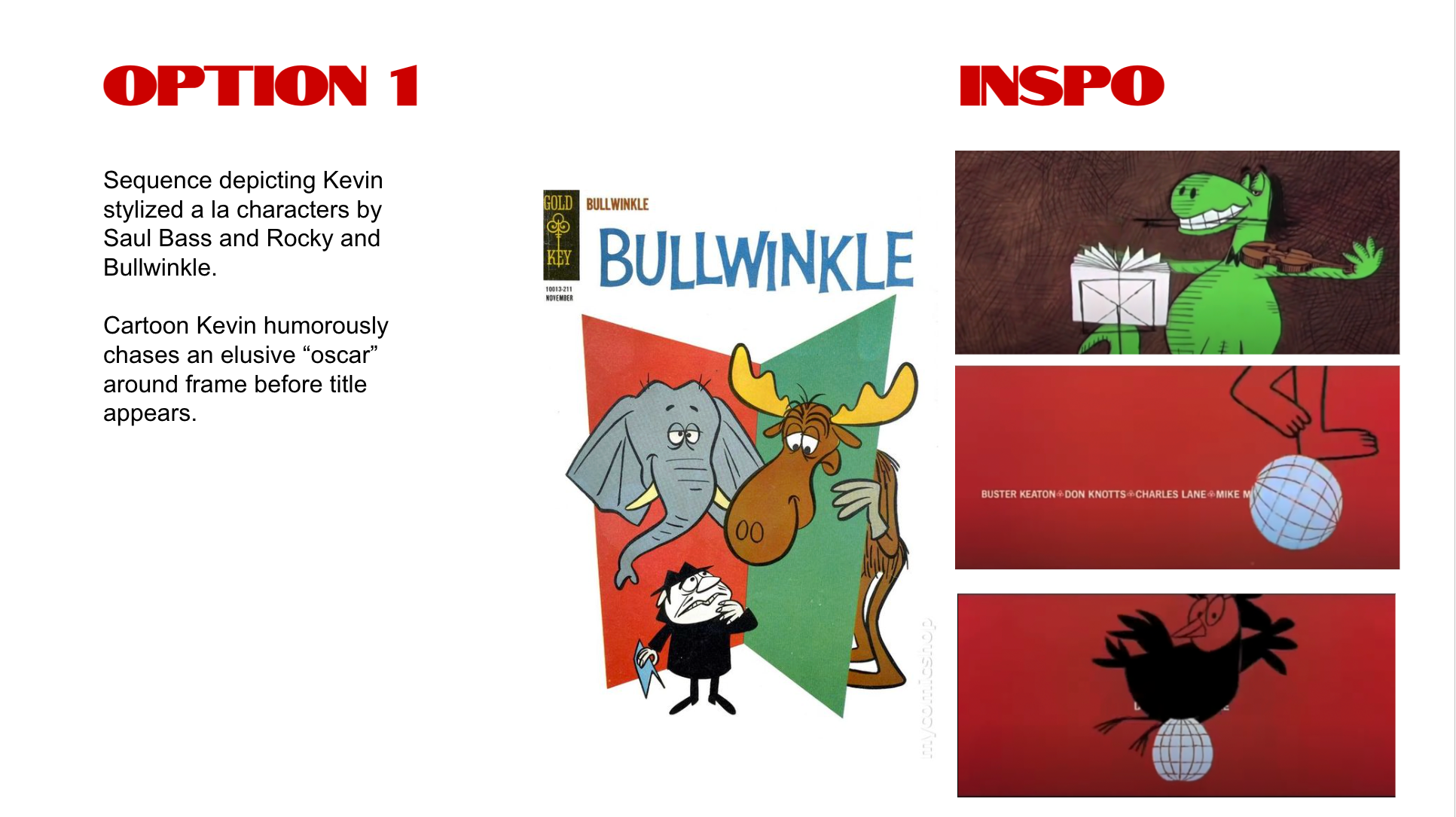
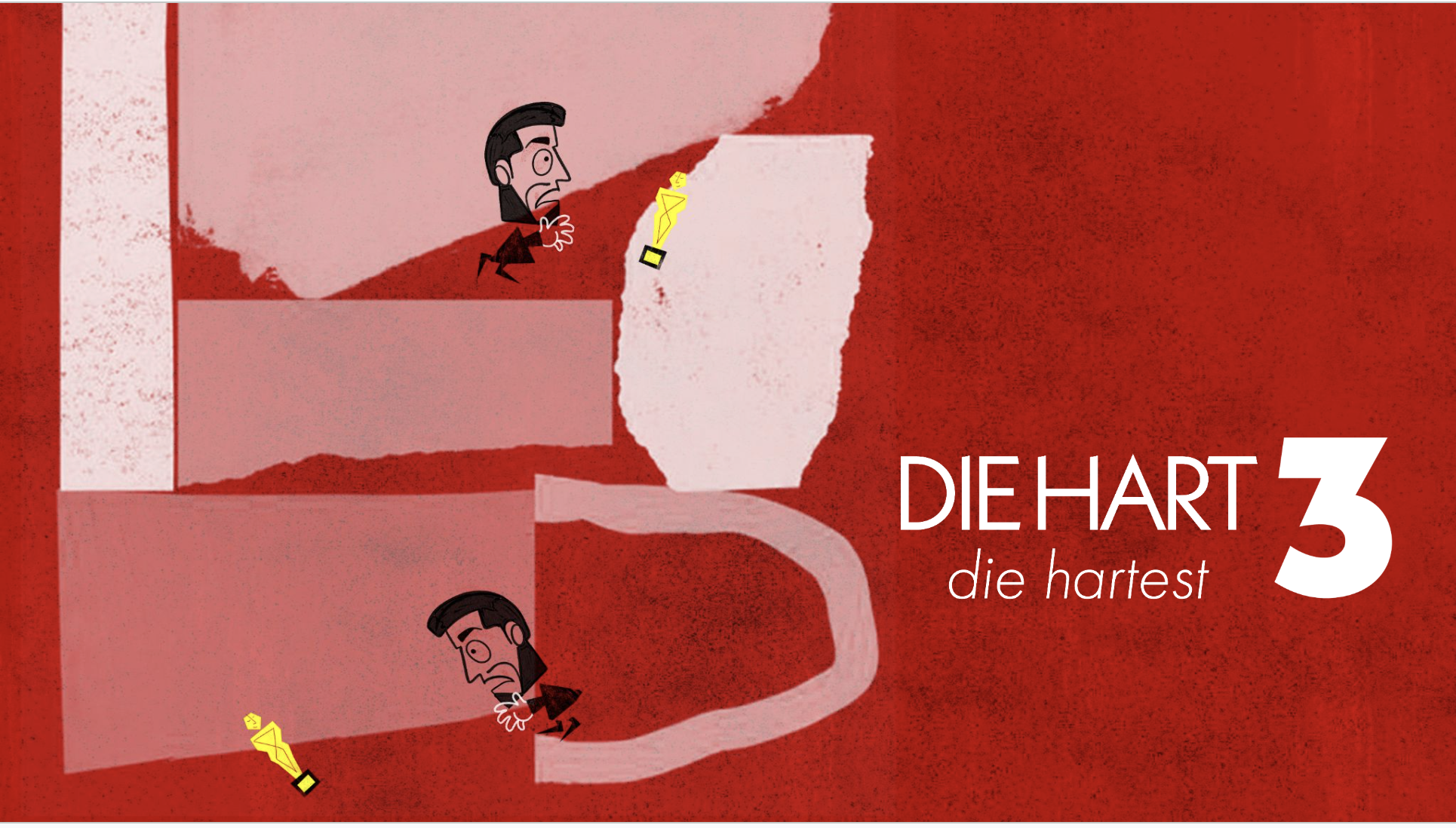
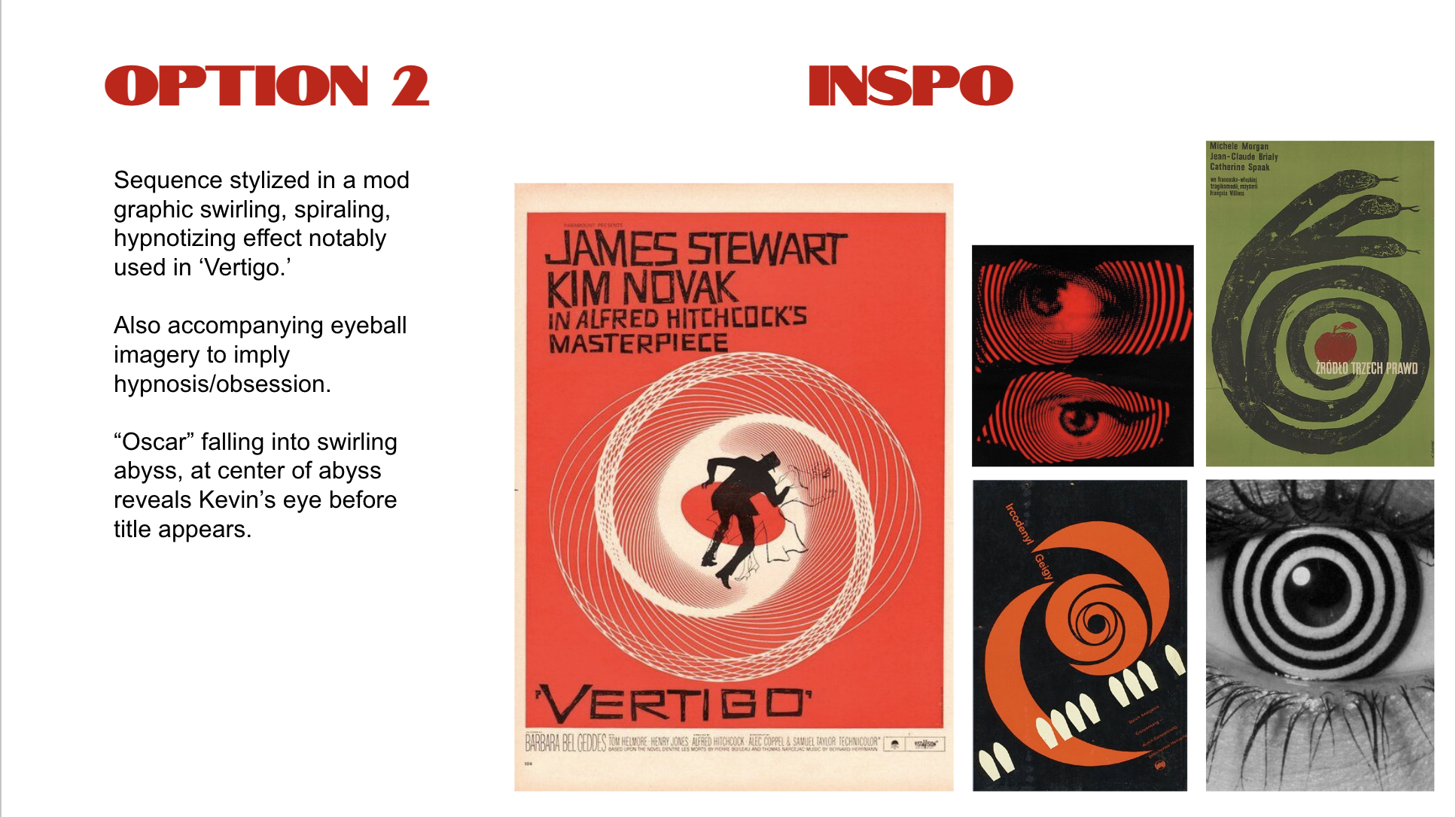
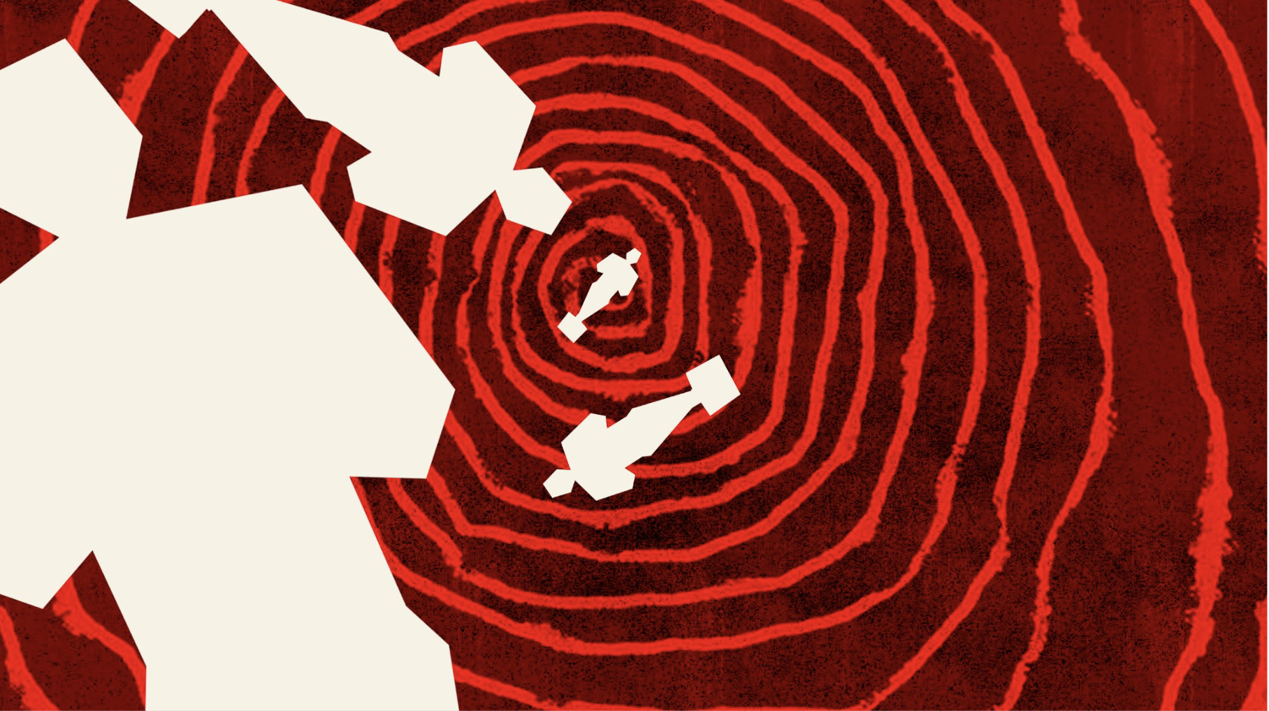
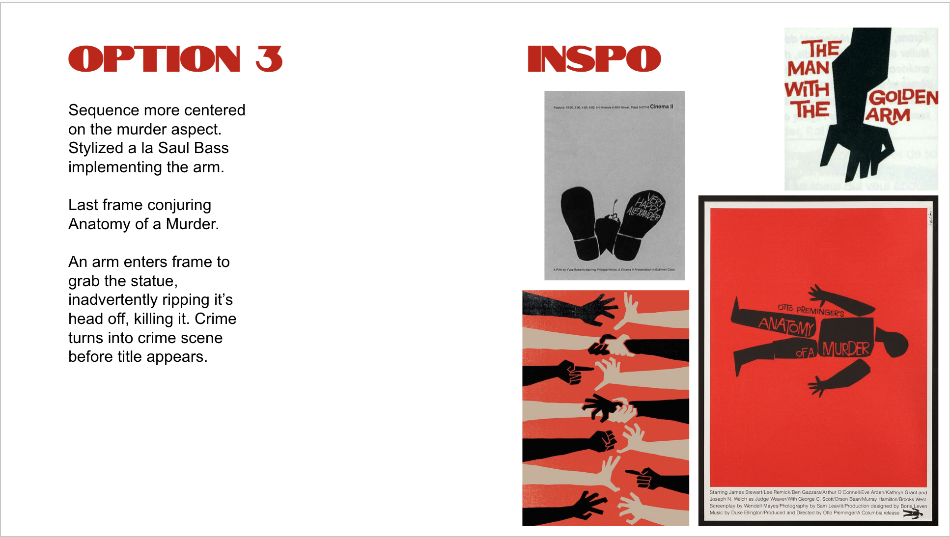
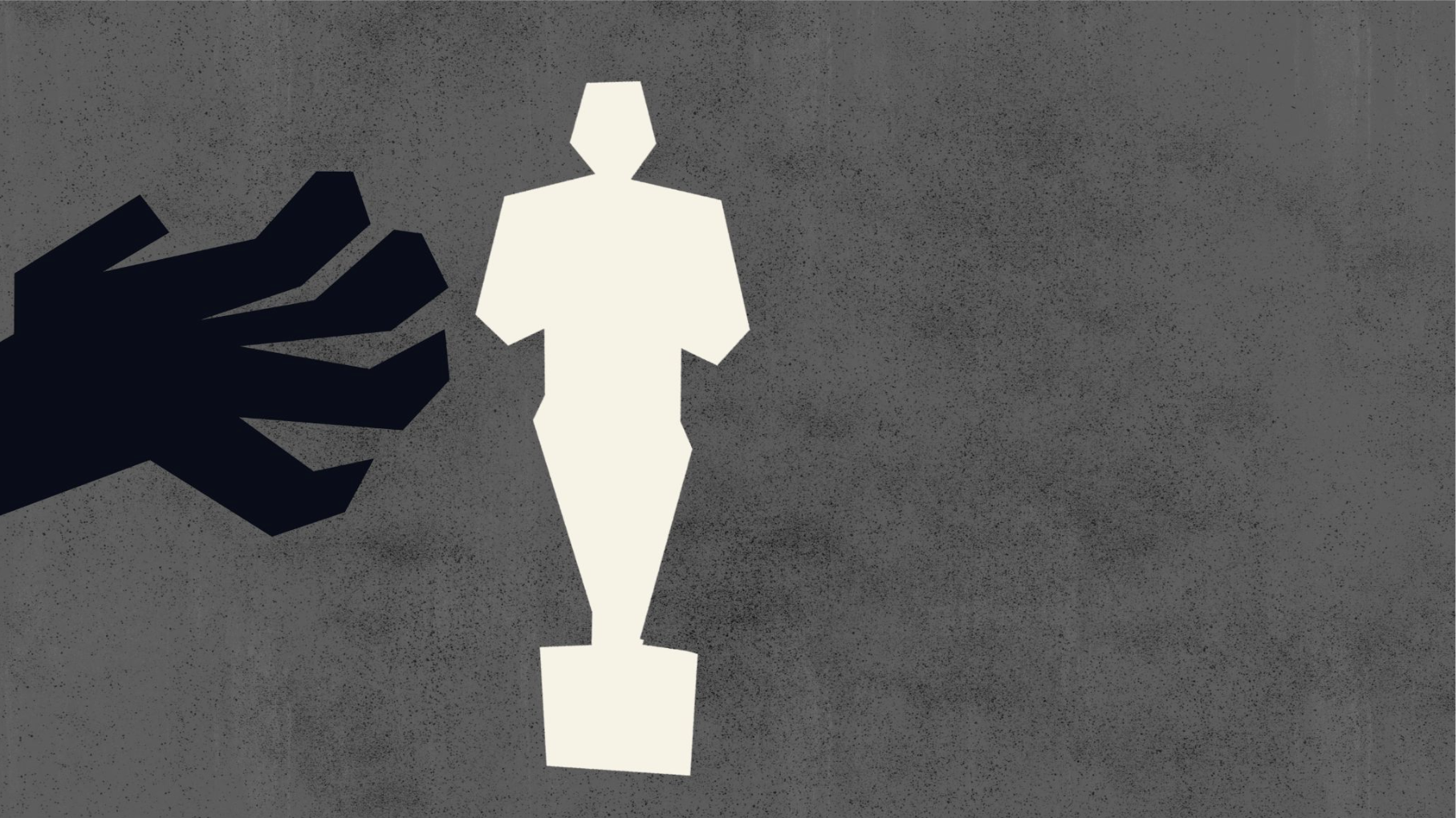
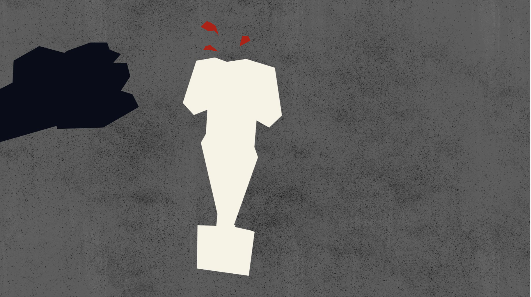
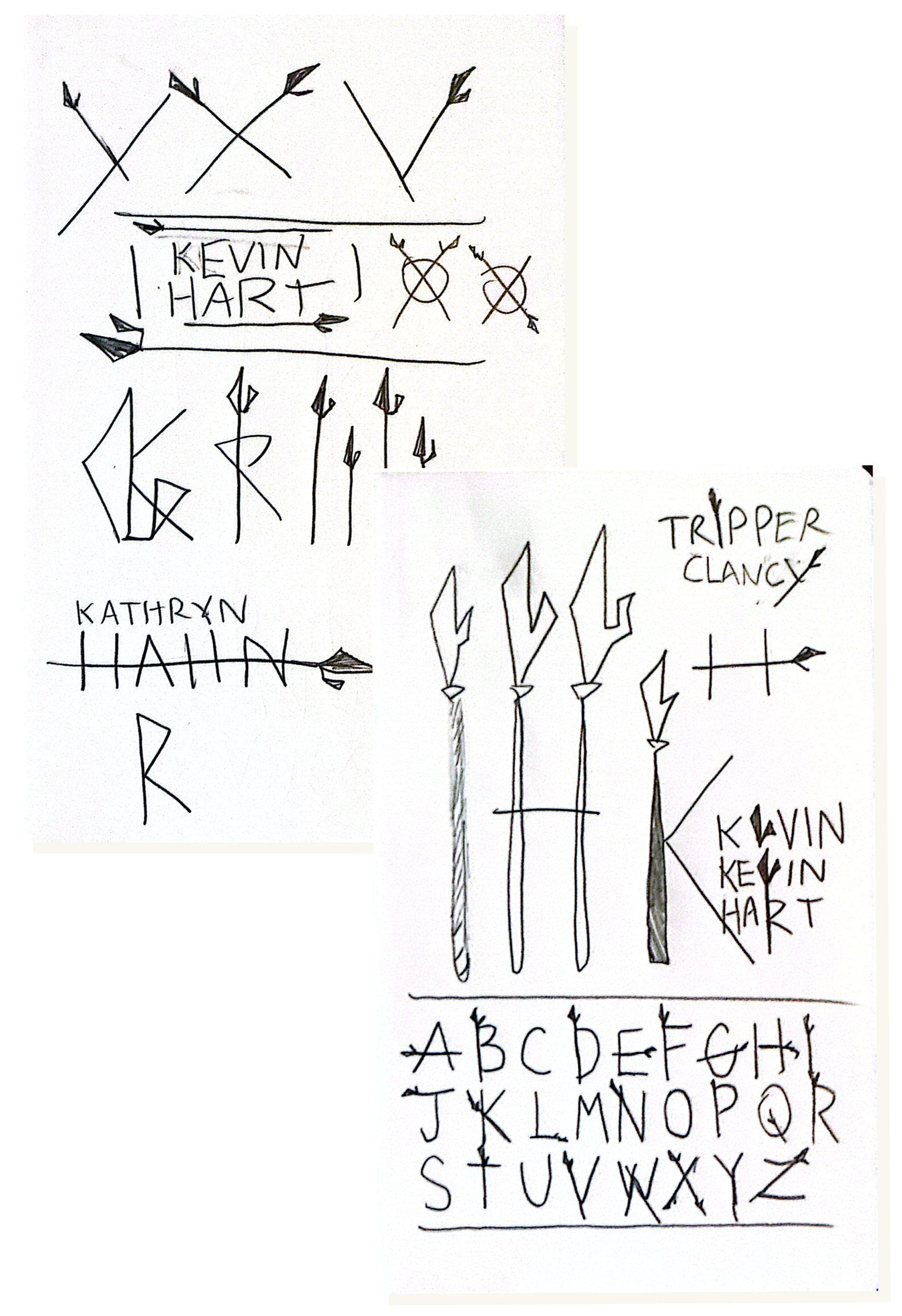
Ruben wanted the title sequence to function as an homage to classic Saul Bass—appropriate for a season parodying arthouse cinema and auteur mythology. The ask was threefold: design the main titles, develop an original title sequence, and create a custom typeface built around the fauchard, a ceremonial polearm that serves as a central artifact in Jackson Pepper's world.
The Sequence
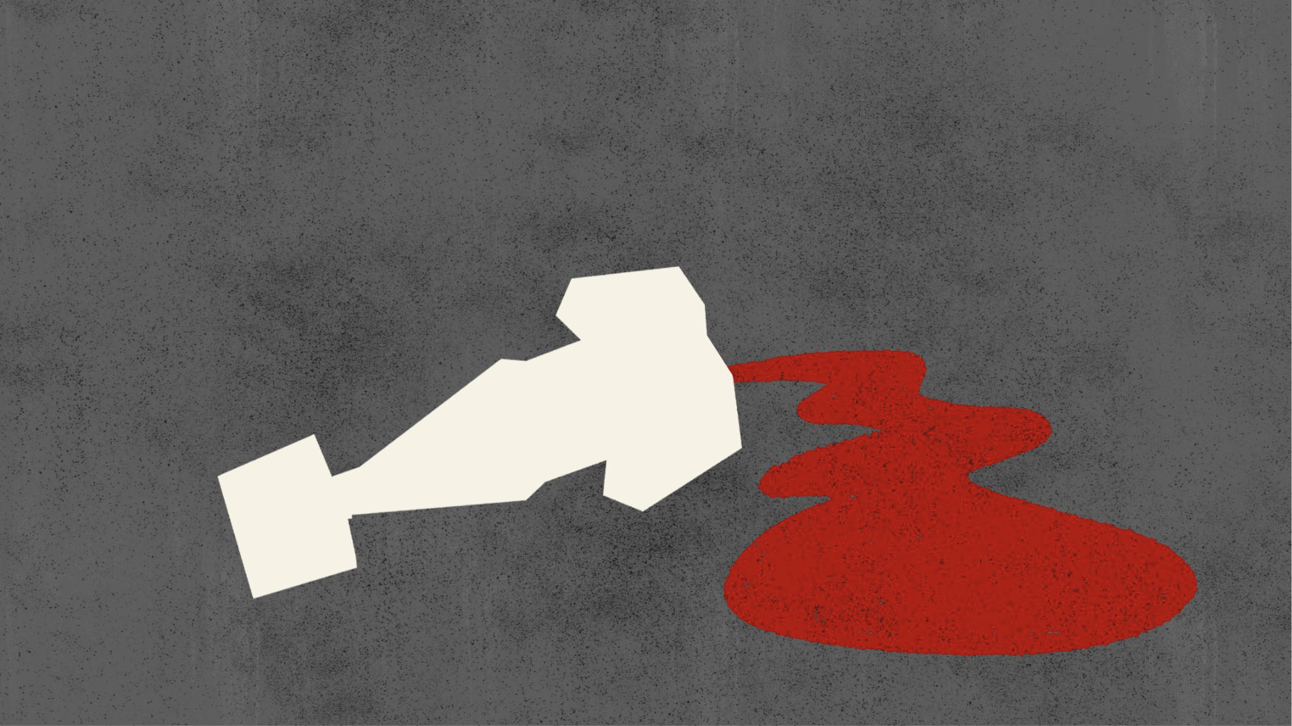
Working with Ruben, I developed and iterated on concepts rooted in Bass's mid-century graphic sensibility: bold geometry, symbolic silhouettes, visual metaphor. The final sequence follows Kevin's cubist silhouette falling through a cyclone, landing in the iris of Jackson Pepper—a visual setup for the power dynamic at the season's core.
Comps For Director Review
Chosen Direction
The Typeface
The Fauchard—Jackson Pepper's prized artifact—became the formal basis for a custom display typeface used across the show's credits. Early versions generated through type software felt too uniform; the mechanical repetition flattened the energy.
So I scrapped the systematic approach and hand-drew every title card individually, preserving the irregularity and sharpness of the weapon's silhouette. The result is typography that feels dangerous and unpredictable rather than polished—true to the artifact and the tone.


World-Building for Kevin Hart's Action-Comedy Franchise
Role: Title Designer & Graphics
Client: Hartbeat / Roku
Director: Eric Appel
Scope: Main Titles, In-World Poster Design, Billboard Composites
The Titles
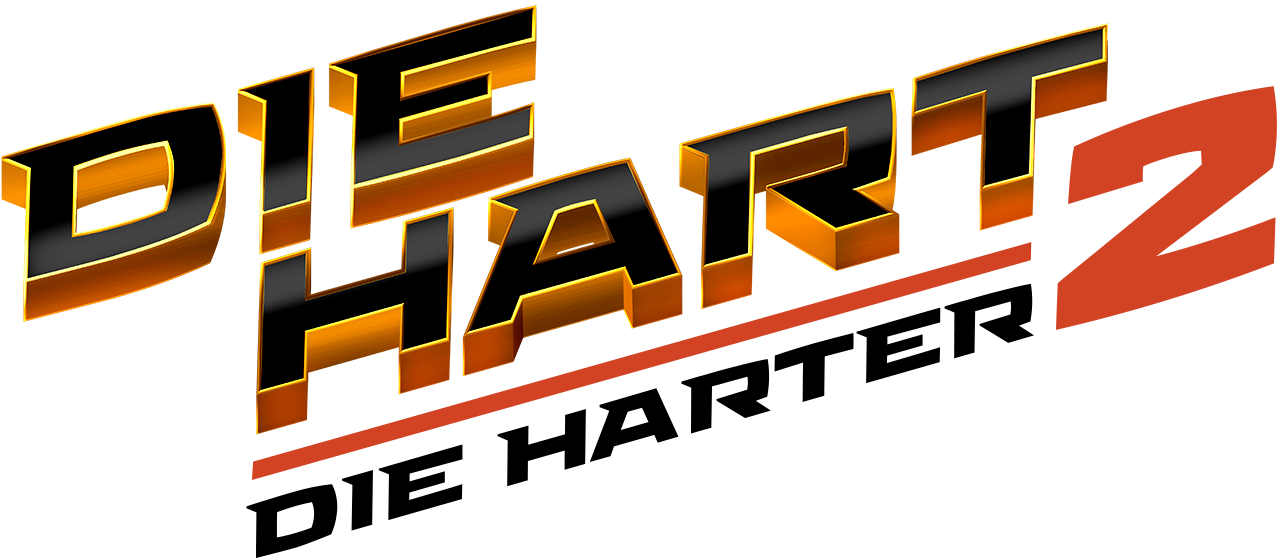
The new season needed a title that committed fully to the action-sequel bit. The solution leans into 80s/90s action franchise aesthetics—beveled chrome, lens flare, stacked typography—evoking Die Hard, Terminator 2, and the era of blockbuster sequel escalation. It had to feel like a real action movie, not a parody of one.
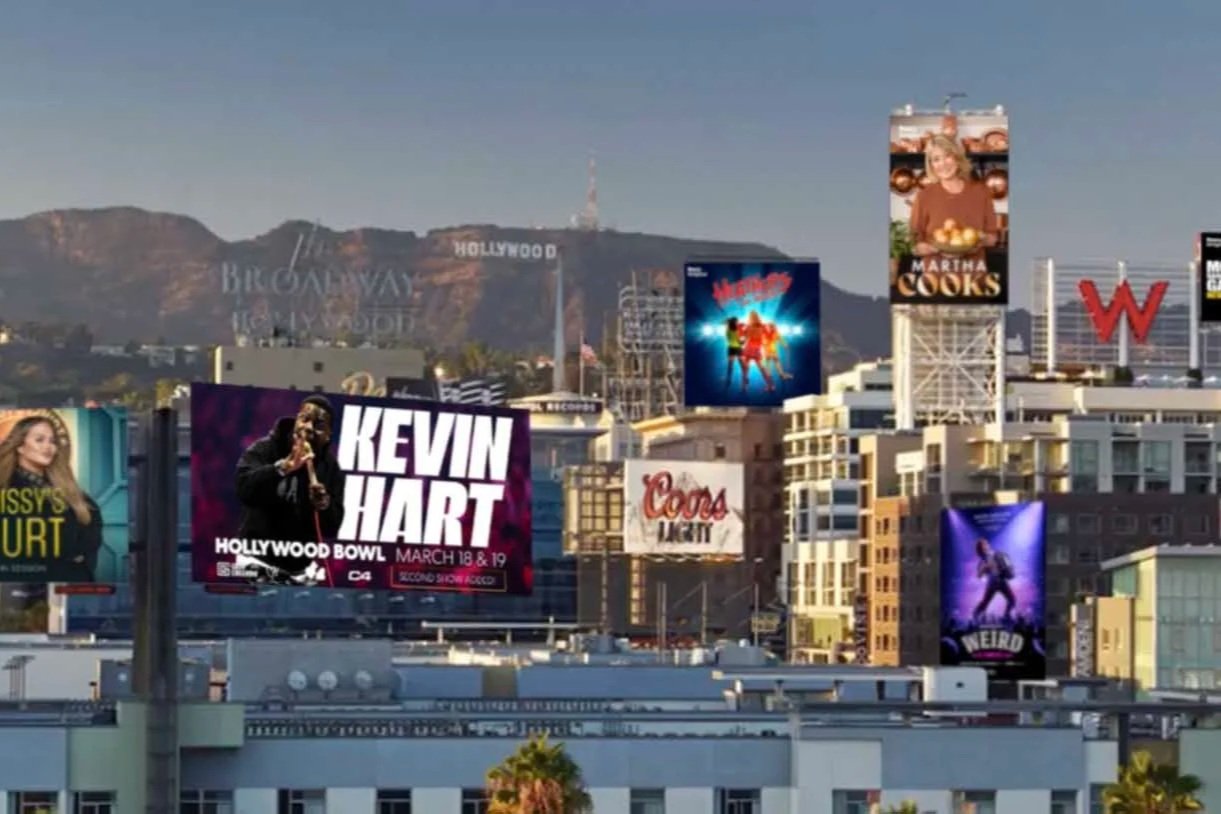
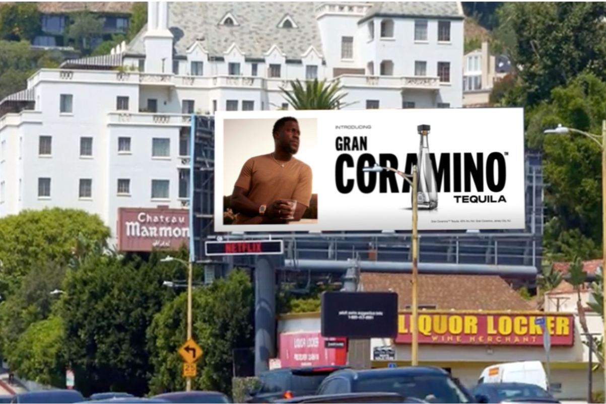
World-Building
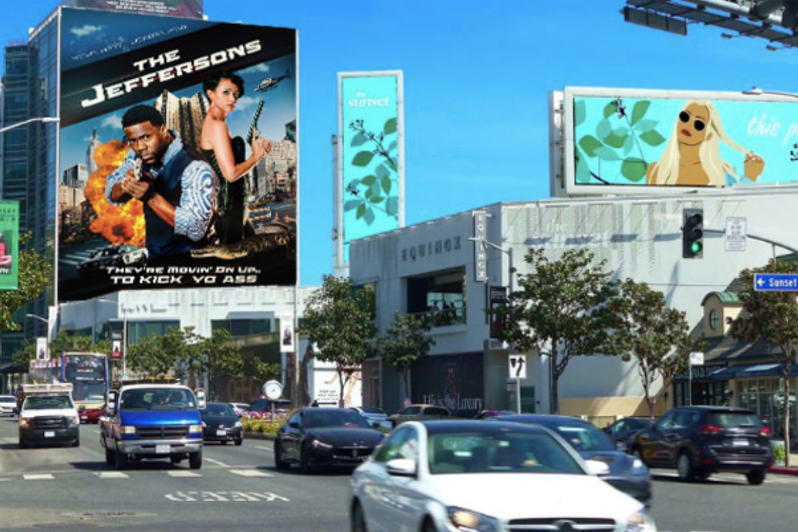
Kevin's character has finally arrived as a superstar, and the world around him needed to reflect that. I designed original key art for The Jeffersons, a fictional action reboot starring Kevin's character—a movie-within-a-movie that appears on billboards throughout the show.
Additional billboard composites featured other Roku IP, building out a Hollywood landscape where Kevin is everywhere.

Outcome
Die Hart 2 became the #1 Roku Original premiere of all time. Season 3 premiered December 2024. Seven Primetime Emmy nominations across the franchise.